
Sample project 06 · Furniture / new brand
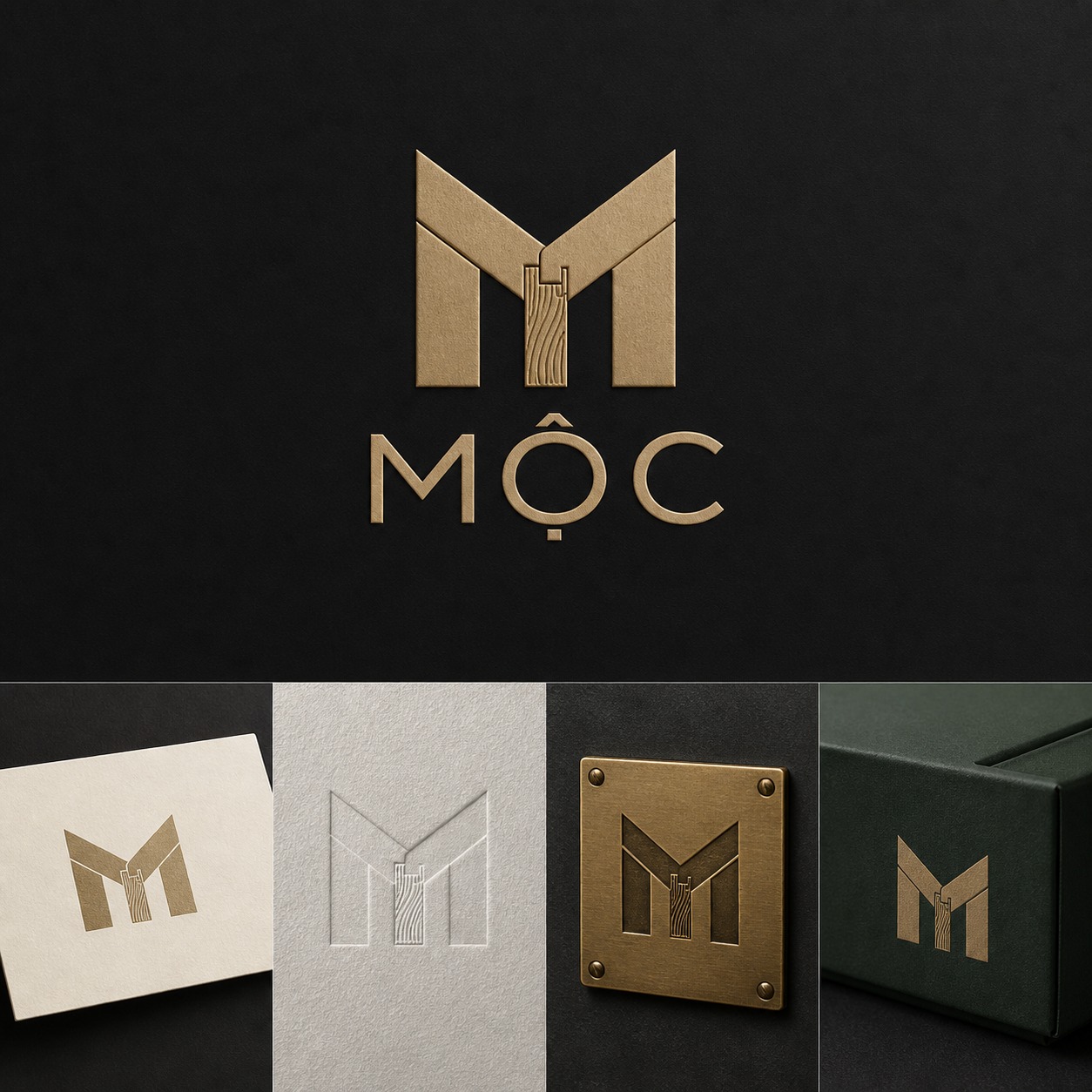
MỘC logo inspired by timber joinery
The letter M is constructed from a restrained joinery structure with a subtle wood-grain detail.
Project analysis
Design begins with the problem.
Create a professional, memorable mark without relying on overused leaf or tree symbols.
- Audience
- People comparing the offer and deciding whether it fits their needs.
- Problem
- Create a professional, memorable mark without relying on overused leaf or tree symbols.
- Strategy
- Study the letter structure and joinery logic.
- Success criteria
- The system communicates clearly and delivers primary and compact logos, colour and type system, core brand applications.
Project process
Six steps from inputs to handoff.
Every step has an objective and approval point. Production does not move forward while critical information remains unconfirmed.
- 01
Collect inputs
Review source materials, required channels, rights and practical constraints.
- 02
Define the problem
Create a professional, memorable mark without relying on overused leaf or tree symbols.
- 03
Approve direction
Study the letter structure and joinery logic.
- 04
Build the key example
Reduce the idea into a clear geometric symbol.
- 05
Expand and quality-check
Test signage, print, packaging and small digital use.
- 06
Approve and hand off
Export and organise: Primary and compact logos, Colour and type system, Core brand applications.
Design decisions
Why this direction works.
The visual system is tied to a real communication job, not a style chosen in isolation.
- 01
Study the letter structure and joinery logic.
- 02
Reduce the idea into a clear geometric symbol.
- 03
Test signage, print, packaging and small digital use.
Deliverables
A usable system, not a single isolated image.
- 01Primary and compact logos
- 02Colour and type system
- 03Core brand applications
Next project
Responsive wellness service landing page ↗
A focused page clarifies the service, value, process and booking action on desktop and mobile.